Very few films I've watched have made me feel uncomfortable but I will never forget the feeling in my stomach that I got while watching the surgery scene in the 2017 film directed by Jordan Peele, Get Out.

As I said in my last post, we have not made a decision on the story itself but we have agreed on certain elements that we both would like to include. I am completely obsessed with color, art directing, and storytelling and I think a specific combination of those things created a really creepy feel to both Get Out and Don't Hug me I'm Scared (but in this post we'll just be focusing on color). Pictured above is a still from the scene and the first thing I noticed was the color palette.

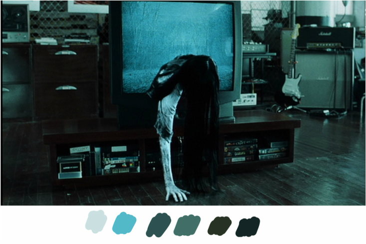
Above is another still from the movie but this combination of colors is synonymous with the horror genre.
The Ring (2002)
The Corpse Bride (2005)

While not every horror film follows the blue-ish theme many include the colors including Don't Hug me I'm Scared which I made a color palette for out of curiosity.


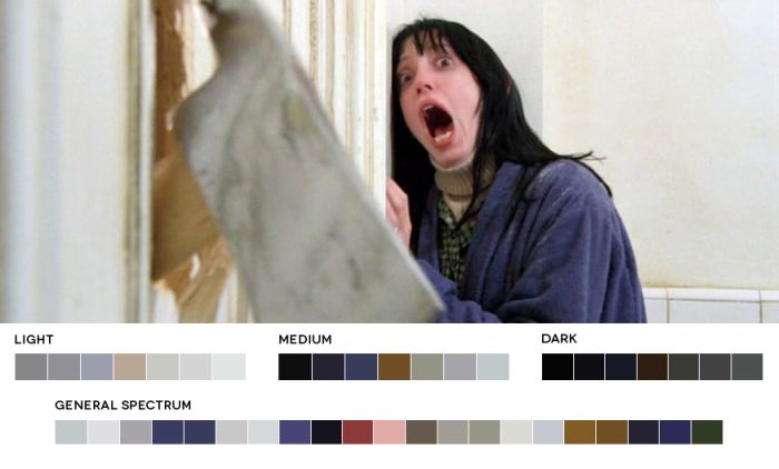
and while there are brighter colors the darker ones are there as well. Movies like The Shining don't limit itself to a single them of color.

My goal is to not limit myself to only one theme of color to create a well rounded and creepy ambience for the entire film.
I also did some research and came across two really good references to use when my partner and I decide what theme is right for us:
https://www.cinema5d.com/film-color-schemes-cinematic-color-design/
http://slides.com/oliviareilly/colour-in-horror-films/embed#/
With the little my partner and I know about the actual storyline, we have a good idea of what we want it to look like which I do think is a good start.
No comments:
Post a Comment